How I make new fractals with Sterlingware
In the previous tutorial sections I've dealt with how the program works so that you will be confident operating it. In this section I'm going to show you how I actually use the program myself.
Although I have no idea how other people use Sterlingware, making new images is probably a combination of personal preference and the program's capabilities. Sterlingware makes experimentation very easy because it quickly produces the new image without requiring any prompting, additional mouse clicks, or closing of the dialog box that you're working with.
While you can't change the actual fractal formulas in Sterlingware, there are still a number of ways to be creative. Firstly, as I mentioned in the section on Generating Fractals, there are 92,000 unique combinations of menu options alone, without even considering the near endless possibilities when using Julia Mode. I don't think they've all been tried yet. Furthermore, each of these new images represents an enormous area of rich details which can be zoomed into, framed up, or "photographed" in a number of ways.
A good eye for composition and a talent for spotting potential photo ops will help in producing great fractal images. Many great photographs have been produced from photographing ordinary, everyday objects. Selection of the subject alone, and positioning it, can be very creative.
By far, the most creative thing you can do with Sterlingware is experiment with the color dialog box. In fact, the effect of changing the color dialog box values is so great that this is where I spend most of my time. Plain looking, or even ugly looking fractal formations can be metamorphosized before your eyes while you adjust the dialog values. The most surprising thing of all is that there doesn't seem to be any logic or underlying method to using the color dialogs that I have been able to find.
It can be frustrating at times, but finding a good color setting can revive old formulas and cause previously dull render methods to produce amazing things.
So here is a typical example of how I make new fractals with Sterlingware.
First, I choose a "menu setting" then I choose a color menu number and finally, head off into uncharted territory with the color dialog settings. A menu setting is any combination of formula, render, transform, and inside-out. The reason I do this first is because changing any one of these options later will greatly affect the color dialog settings and I'll have to make major readjustments, which is like starting all over again. It's near impossible to fine tune the color dialog settings when you're changing basic things like formula or render method. What works for one formula will probably work with several others too, but first I have to concentrate on just one formula because adjusting the color dialogs is a rather delicate thing.
So, I choose any formula, add any render, then pick a transform and choose inside-out or leave it off. All the formulas are good ones so I may pick any of them. The render settings I most often use are 2-5, 8, 14 and 18. The rest I haven't had good results with, but that may change. Transform "none" has been my usual setting but lately I've found arctan to be a good one also. With Inside-out you just have to try it and see which is better.
I now have a "menu setting." Next I choose a color menu number. I mostly use 13, 14, or 24. and leave the rgb menu set on 1. Any of those three color numbers will do. I don't know how they work but they seem to do more than just change the color of a fractal. This perhaps is why adjusting the color settings is such a powerful thing. I think each color number is a filter which changes the drawing style or presentation, of the fractal image. This has a direct effect on the colors but also modifies other aspects of the image such as light, shadow and surface texture.
I will now keep these settings and fine tune them with the color dialog box. What the image looks like at this point is not important to me because the color dialogs will create the final image. If it's ugly, that's okay. In fact, many of my best discoveries have come after doing things I normally wouldn't do or, considering all the possibilities, choosing one that hasn't been tried yet. I usually start with images that have something appealing to them. Starting with an ugly one just might lead to something new.
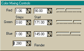
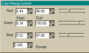
Whenever a change is made when working with the color dialog box, the image is automatically updated. If I had to close the dialog box and hit "apply" everytime, I probably wouldn't use Sterlingware this way. There are only seven of the thirteen color dialog values that I adjust. I never touch the three Saturation or Offset values. I've tried adjusting them before, (I think I've tried adjusting everything) but the results were never very good. So I only adjust the "Steps", "Start" values, and "Render"
I've often wondered what Sterlingware would be like to use if it had the capability of creating random color dialog values at the click of a single button. This would input a random number for all seven values which would then be immediately displayed. Most of these would look awful, but working your way through a hundred or so would be very easy and soon you would have a good one, or one that needed only a little fine tuning.
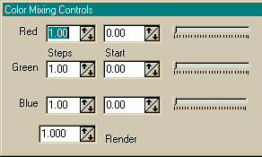
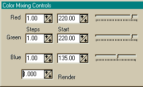
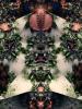
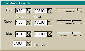
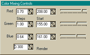
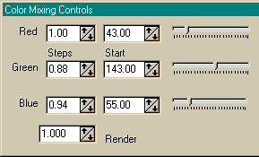
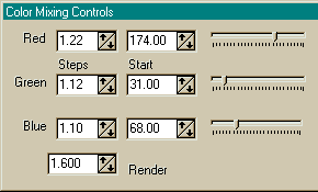
I start to change the color dialog settings by making random-like inputs. Say, low render (0.100 - 1.000) two high steps (1.000 - 4.000 or more?), one low step (below 1.000), Red, Green and Blue start values mid-way (130). It might look like this:
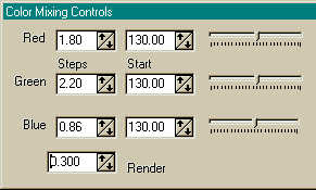
or this:
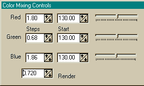
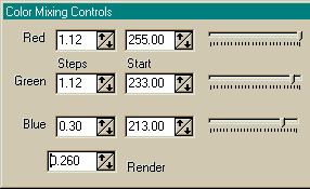
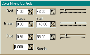
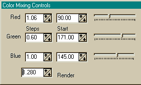
I now probably see some faint, washed out smudge. I would do some fine-tuning by moving the start values to achieve a sharper, more focused image. That is, one that has more clearly defined shape and structure. The Red start value seems to have the greatest effect on the image so I usually adjust it first and then the other two. Once I start to see something good, I would then adjust the render and then one of the step values. The object here is to find a new group of the seven values that works together, is compatible, balanced. Each value changes the others so the process starts with scrambling the values and then making adjustments here and there to balance them. As I said, I haven't found any underlying logic or method to the "seven values." The end result with seven different numbers should be something new and different. Here are a few examples of color dialog values along with an image produced by them.
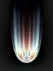

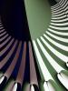

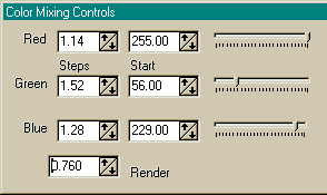
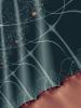
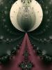
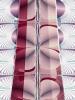
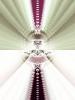
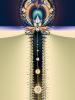
All of these images are from my gallery where you can view the fullsize version or download the parameter files (.loo) and recreate them in Sterlingware.
When I have a nice color setting or color scheme, I try zooming in a bit and coming back. I make color dialog adjustments if I start to see ugly stuff. I may try toggling Inside-out off or on and zooming in a bit to look around. There will usually be a part of the Inside-out image that contains the colors of the other image. I will probably try a few Julia Modes at this point. These can be very surprising but the Julia images should be just as compatible with the new color scheme as the non-Julias. Next, if things are still looking good, I try moving through the formulas to see how my new color scheme looks with other formulas. I always zoom in a bit because what you see at first may change further in. The formulas can be grouped together according to their compatibility with color schemes. For instance, if a color scheme looks good with one of the Newton variations, it will probably look good with them all.
What to do if things aren't working.
When I've been adjusting the color settings and getting close enough to something to keep trying, but not close enough to be sucessful, I often do these things:
- Change the rgb menu numbers and see what happerns.
- Change the formula, but keep the render the same.
- Change the color number.
- Do something different, scramble the RGB start values and fine tune it by adjusting the steps. Or, scramble the steps and fine tune with the RGB values.
- Change just one value greatly and rebalance the others.
- Change the render value; start stepping up from a low value or stepping down from a high value.
I'm sure everyone who makes fractals must eventually develop similar methods or strategies as they become more familiar and comfortable with the program they use. I hope this glimpse into my fractal workshop has sparked a few ideas.